Supporting materials
Download
Download this article as a PDF

Experience data like never before! Use kirigami and participatory statistics to create low-cost, hands-on multisensory visualizations to engage and inspire.
Data has become a powerful tool in our lives, helping us understand the world beyond biases and misinformation. But without engaging communication, this wealth of information and its analysis often goes untapped. Enter data physicalization – the ultimate approach that transforms data into multisensory experiences, enabling you to hear, touch, and interact with information. This method complements traditional analytical approaches in statistical education, serves as a playful introduction to the topic for younger students, and enhances communication whenever data is used, regardless of the subject.
In this first article of a series on tangible statistics,[1,2] we dive into the world of kiristats and participatory statistics. These accessible, low-cost, and creative activities bring data to life, making them perfect for any classroom.
Using kirigami, an ancient Japanese paper-cutting technique, students can transform simple cardboard sheets into outstanding representations of complex data, while having fun and sparking creativity.[3] Here, we’ll guide you through creating kirigami age pyramids, opening up discussions on demographics and migration.
With participatory statistics, students and communities can engage directly in data collection and visualization, making learning a truly collaborative experience. In the proposed activities, participants shape the data landscape themselves, using colourful wires and simple tools to build visualizations that tell compelling stories.
The hands-on approach not only makes data more inclusive, but also encourages a deeper understanding and critical thinking. These dynamic activities are not just educational but transformative, making any subject, like history or social studies, come alive with interactive data exploration.
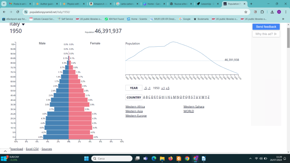
Imagine having a snapshot of the world’s population at your fingertips, revealing the secrets of past events and future trends. An age pyramid is just that – a fascinating tool that lets us peek into the demographic shifts shaping our world. By analyzing age pyramids, students can uncover the social and economic implications of demographic events, sparking discussions about future challenges and opportunities, to reflect on how a youthful boom or an aging wave can shape a country’s needs and dreams as well as those of its neighbours. It’s more than just data – it’s a way to connect history, society, and the choices we make today, helping students see the bigger picture and think critically about our shared future.
Kirigami three-dimensional (3D) age pyramids are very easy to make and can be explored and manipulated for a deeper understanding and engagement. With an added touch of colour, multiple data layers can be visualized, offering a richer food-for-thought experience for the simple cost of scissors, paper, pencils, and creativity!
In this activity, we compare the age pyramids of higher- and lower-income nations to forecast social and economic changes over the next 20 years and beyond. We explore migration trends, policies, and strategies to ensure sustainable and equitable development. This activity is suitable for students aged 11–19. The activity itself takes an hour and is followed by 20 minutes of discussion.
Remind students to always keep the cutter in safety mode when not in use: blade cap on or in the safe position. Metal rulers and cutting boards are recommended.
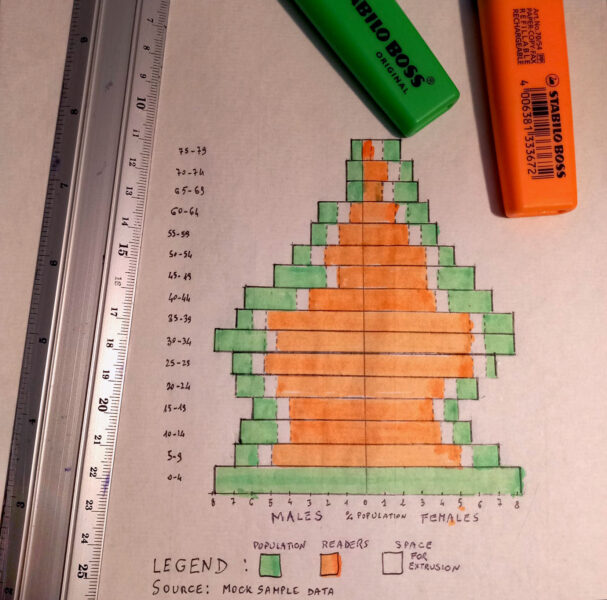
To include more data layers,[4] for each cohort, work on white cardboard and colour the strips, highlighting new pyramids within the main one. Be sure to add a legend. In the example in figure 3, we embedded data about education levels.
Here are some tips and suitable questions for the classroom discussion/debate. The teacher may choose to start simply, limiting the analysis to a single country, or dig deeper by embracing a global view.
Focus on one country: if the group chose to focus on a specific country, which years are particularly significant to illustrate its demographic evolution? Is it possible to glimpse the future from the pyramid data of a specific year? Which age groups should be carefully considered for future projections? Are there noticeable differences between males and females, or do both trends appear to be similar? Can you find clues for impactful past events?
Priorities and challenges: reflect on the priorities and challenges faced by previous generations, such as your parents and grandparents. Consider the new and specific issues your generation will need to address. Which areas should be prioritized – education, healthcare for an aging population, job creation, and so forth? Why?
An interconnected world: in our increasingly interconnected world, we cannot view ourselves as isolated, self-sufficient systems. Consider how demographic developments in surrounding regions might serve as both challenges and resources. Can you support your insights with additional age pyramids from other areas? Regarding migration, which countries exhibit unstable or rapidly expanding population pyramids? Why do countries like Qatar and the Emirates have uniquely shaped pyramids?
Acting for change: finally, consider the factors that could alter the model predictions. How might these changes unfold and over what timeframe? Understanding the factors influencing a population’s age structure is crucial for making informed decisions today that will shape the future.
Sometimes it’s good to get quick feedback from students about their day/lesson in an engaging hands-on way with a tangible eye-catching visualization. Results are immediately and easily shared with colleagues and the whole class as food for thought for a better school experience. Figure 4 shows a poster with a whirlwind of tiny paper planes of all shapes and colours. Each student chooses one and pins it in position, according to their mood. There are three parameters: colour (ranging from red to blue, corresponding to mood), dimension (intensity of the feeling), and position (up in the sky for an outstanding experience, at the bottom for total failure). This simple, yet effective, method allows students to freely express their feelings and engage in data visualization, fostering a sense of belonging and empowerment.
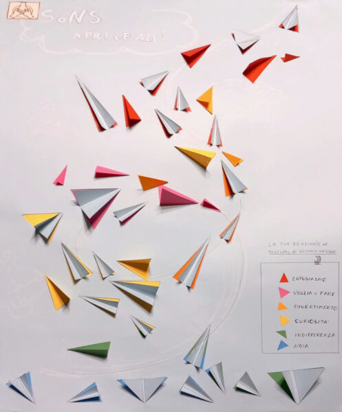
The sample encompasses all the key elements of a successful participatory statistics activity: it is visually appealing (featuring bright colours and evocative images), quick and easy to complete, actively engaging, and incorporates a few functional parameters to encode multiple layers of information. As data is collected, the visualization naturally emerges, making the resulting pattern instantly visible and understandable.
For a complete and meaningful learning experience, students should, after testing the method themselves, design and set up their own participatory statistics projects. They should also include a short report on their design process, explaining the parameter choices and the implicit meanings.
The main activity should only take around 20 minutes if the teacher sets it up before class and the students just add the data points and discuss the outcome. However, additional lessons will be required if the students then design and run their own surveys (extension activity).
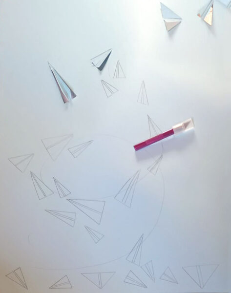
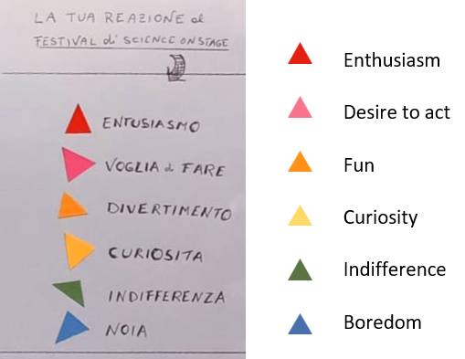
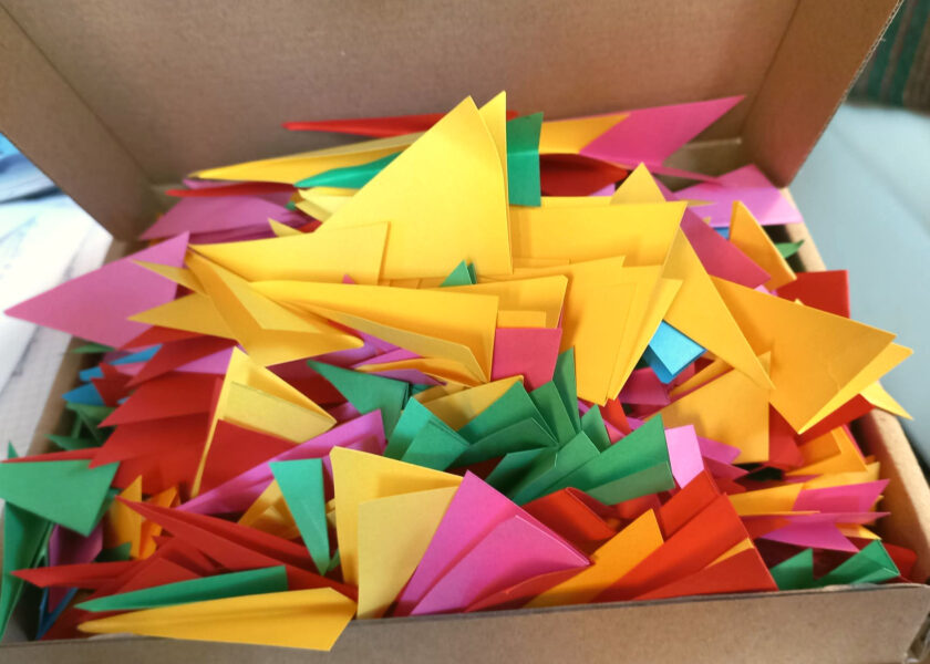
Inspired by the plane posters, students should design their own ‘wellbeing feedback’ activity (activity sheet 2). Divide students into small groups of three or four. They should consider the significance of colours, shapes, and sizes because evoking emotions through aesthetics is crucial for gaining public commitment. It’s important they ensure responses are fast and straightforward, keeping the public engaged and encouraging them to take action. This process fosters creativity and encourages students to engage deeply with the data.
The steps that they should follow are outlined below.
Discuss and decide on the following elements, ensuring that every detail has a meaningful purpose:
Add a short accompanying report describing your design process and detailing the meaning of each of your above choices. Remember: nothing is left to chance; everything is carefully planned with a meaning and a purpose. Peer review among groups may be a brilliant add on to the activity!
Ideally, give students the opportunity to build their boards and run their survey. This can be done in class (e.g., a different student group every day) or somewhere in the school, or after a school event like an assembly.
This activity involves using coloured wires to create visual data representations on a board.[5] Students design a questionnaire and use knobs and wires to depict different answers, creating a visual pattern that reveals insights. This activity takes 60 minutes to design the board, 10 minutes to run the activity, and 20 minutes for the evaluation. It is suitable for students aged 11–19.
Predrilled reusable boards may be safer and quicker (i.e., 8 columns with 4 holes each). Students can then decide how many to use.
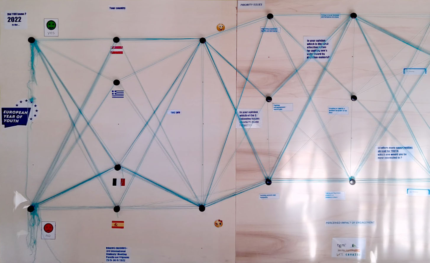
Students reflect on the results, exploring new insights, and discussing possible actions based on the collected data. Are the answers what they expected, or do they reveal aspects the students had not been aware of? Is there some area of interest on which they may follow up? Participants in the questionnaire may have declared themselves as being in favour of being further engaged in conversation with the community, or they may be asked for more information.
These activities offer a cost-effective way for students to engage with data in a multisensory, inclusive, and creative manner, all within an interdisciplinary framework. They promote critical thinking and creativity, making data analysis an interactive and enjoyable experience with a focus on communication. Additionally, they also offer the opportunity to reach out to and engage with the surrounding community.
[1] Lisotti A, Vicini L (2023) Tangible statistics. IASE 2023 Satellite Paper 36–41.
[2] Lisotti A, BeReady pilot activity: https://www.beready.pw.edu.pl/doc/IO3-summary.pdf
[3] Daneshzand F, Perin C, Carpendale S (2022) KiriPhys: exploring new data physicalization opportunities. IEEE Xplore 29: 225–235. doi: 10.1109/TVCG.2022.3209365
[4] Reiter C (2021) Population pyramids by skills-adjusted education: estimates for 45 countries. Submission for the International Population Conference 2021.
[5] Moretti M (2018) Participatory data physicalization. Free University of Bozen-Bolzano.
Download this article as a PDF
Do you find the binary system complicated? With this activity, your students will find it as easy as…

Sketch graphs from ‘story’ videos of everyday events to help students understand the basic features of graphs and how to interpret…
Use the Education corner on the Eurostat website to bring real-life data to your class and teach your students about statistics.